When designing an office space, many people focus on layout, furniture quality and technology—but colour often gets overlooked. Yet the hues you choose can have a profound effect on employee morale, productivity, and even how clients perceive your brand. This is where colour psychology becomes a powerful tool in office furniture design.
Table of Contents
The Science Behind Colour Psychology
Colour psychology is the study of how colours influence human emotions and behaviours. In a workspace, where employees spend hours each day, the colours that surround them can either energise, calm, inspire, or even distract. Choosing the right palette for your office furniture is about more than aesthetics—it’s about creating an environment that supports your people and your purpose.
The Role of Colour in Office Design
Each colour has a different psychological impact. Here’s a breakdown of how popular colours used in office furniture can affect your workspace:
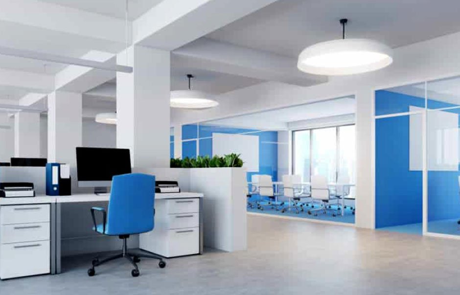
- Blue – Calm and Productive: Blue is often considered a safe and universally appealing choice. It evokes a sense of stability and calm, which makes it perfect for high-pressure industries like finance, tech, or law. A blue-toned workstation or desk can help improve focus and reduce stress.
- Green – Balance and Wellbeing: Green brings the refreshing energy of nature indoors. It’s known to reduce eye strain—ideal for work environments where employees spend a lot of time on screens. Incorporating green through chairs, soft furnishings or collaborative zones can enhance creativity and wellbeing.
- Yellow – Optimism and Energy: Yellow is the colour of sunshine and positivity. It’s great for creative industries or brainstorming spaces where enthusiasm and innovation are encouraged. Used in moderation—perhaps as accent pieces or feature chairs—it can uplift moods and stimulate fresh thinking.
- Red – Passion and Urgency: Red demands attention. It’s best used sparingly, as it can raise energy levels and even heart rates. In an office setting, it’s ideal for breakout zones or sales departments where energy and action are the goals.
- Grey – Sophistication and Neutrality: Grey is timeless and neutral, making it a favourite in corporate settings. It pairs well with bold accent colours and can create a sleek, professional feel when used in office workstations and cabinetry. However, too much grey can feel sterile, so it’s best balanced with warmer hues or natural textures.
- White – Cleanliness and Simplicity: White conveys cleanliness and clarity. It can make smaller offices appear more spacious and open. While white furniture adds a minimalist feel, it works best when combined with pops of colour to avoid a clinical appearance.
Aligning Colour Choices with Brand Identity
Your office should reflect your brand’s values and personality. For example, a legal firm may benefit from blues and greys to convey trust and professionalism, while a marketing agency might thrive in a vibrant mix of yellows, reds and greens to inspire creativity. When selecting pieces, consider not just functionality, but how colours align with your visual identity and the message you want to send to staff and visitors alike. For those looking to create a harmonious and effective workspace in Queensland, the team at Office Furniture Brisbane offers a wide range of stylish and ergonomic furniture options in a variety of colours, finishes and configurations to suit any business environment.
Colour is a silent influencer in the office
It affects how we feel, how we work, and how we connect with a brand. By thoughtfully integrating colour psychology into your office furniture design, you can create an environment that not only looks great but also supports the performance and wellbeing of everyone in it. When it’s time to refresh your workplace, don’t just think form and function—think colour. It might just be the secret ingredient your office needs.